Icons
Icons are used to help communicate information to users. Icons can provide supporting information and help users to recognize common ideas, concepts and actions. Icons are visual cues and should not be used alone, they are supporting elements.
The DHIS2 Design System provides a library of icons for use in DHIS2 applications. Using icons consistently helps users to recognize common DHIS2 actions and concepts.
Quick links
ui implementation of the DHIS2 Icon Library. (To be updated after v1 of ui-icons is released).
Using icons in DHIS2 applications
Communicating with icons
Icons should only be used to support other content, like labels. Icons should not be used alone. An icon can be interpreted in different ways, so relying on an icon to communicate a single idea will lead to confused users. Icons will most often be paired with a text label. In this case, the icon is a supporting element.
![]()
In cases where displaying a text label explanation for an icon is impractical, make sure that the icon meaning can be clarified with text. If using a padlock to imply a locked state, make sure that hovering the locked element provides a textual explanation of it's state too.
Not all actions need icons. Consider whether an icon is supporting the text label, or just contributing to visual noise. If in doubt as to whether an icon will help or hinder users, do not use it.
Consistency
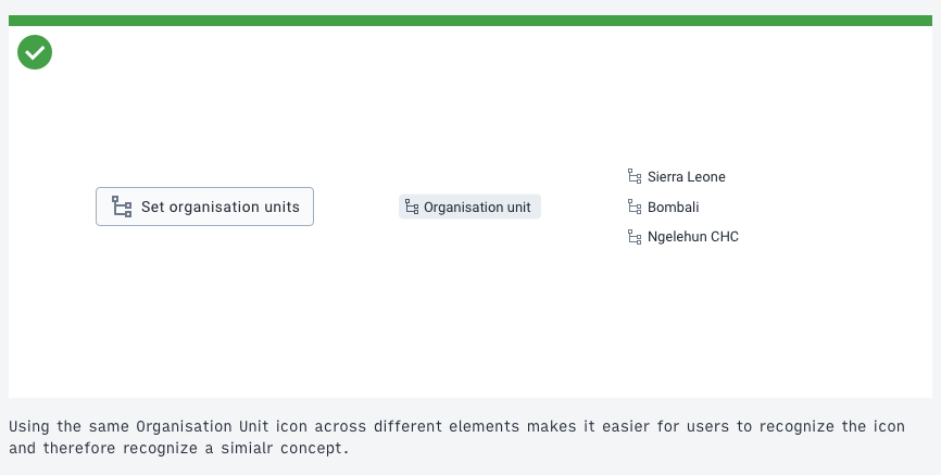
Icons are most useful when users can recognize them and pair them with ideas and concepts. This requires that icons are used consistently. Using the same icon for the same concept means that users can recognize similar concepts across different DHIS2 applications. For example, using the same "Organization Unit" icon across all DHIS2 applications means that wherever users see that icon, they will recall the concept of DHIS2 organization units.

Icons provided by the DHIS2 icon library sometimes have names that imply what the icon should be used for. "Fullscreen" icon, for example, should only be used when communicating a concept related to fullscreen mode. The "Edit" icon is pen but should only be used to represent an edit action, not a writing action. Some icons, like arrows or common marks, can be reused and are therefore named after their object.
Sizes
Icons are available in different sizes. Always use the icon at it's intended size, the shapes have been created specifically for each size. Icon sizes are being added gradually, so some icons may not be available in all sizes. You can request an icon size, if needed.
Color
In most cases, icons should be used in the same color–or a few shades lighter–as the content they are supporting. Icons are supporting content and should not distract from their purpose with contrasting colors.
![]()
Color can be used as an additional supporting element when an icon communicates a state. Remember that color cannot be relied upon to communicate alone. An icon and a color can be a useful way to add extra information that is accessible to all.
![]()
Alignment and spacing
Align icons with the vertical center of the content they support.
![]()
Icons provided by the DHIS2 icon library have padding and margins included to ensure visual consistency and weighting. Additional padding can be added if necessary, but should not be needed in most cases.
DHIS2 icons and Material Design icons
DHIS2 applications have used, and continue to use, Material Design icons. Applications can now transition to use the DHIS2 icon library. For the sake of consistency, it is recommended to always use icons from the DHIS2 icon library and mixing icon libraries. Missing icons can be requested here.