Content & Communication
Communicating consistently helps DHIS2 users understand, use and extend DHIS2. Follow these principles, each of which is expanded below:
- Use words that are easily understood, consistent and not unnecessarily technical.
- Help the user to build a mental model of the DHIS2 platform and applications
- Communicate errors clearly and with guidelines or actions
- Keep the user informed about application status
- Use a clear, honest and friendly tone of voice
- Only refer to a user, using you/your when necessary.
Communication
Use understandable, consistent language when communicating with a user. Provide information that is relevant and useful. Avoid unnecessary confusion by communicating in clear terms. Do not talk down to users, regardless of their technical ability.
Keep communication concise and to the point. Do not attempt to guide the user through all parts of an interface, the interface should speak for itself. A short introductory text for sections within an application is enough to give the user context to explore further. Where more guidance is necessary, refer the user to the relevant documentation.
For example, when prompting a user to confirm an action:
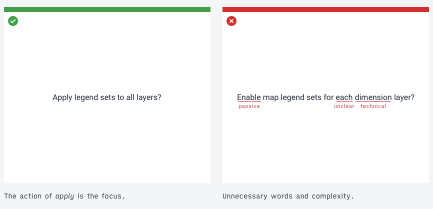
The correct example is clear, still providing enough detail about the consequences. Focusing on the intended action: applying legend sets to layers, makes the text easier to understand. The incorrect example uses several unnecessary words, DHIS2 technical terms and passively states the action. The correct example directly states the action and consequences.
Building a conceptual model
A conceptual model helps the user imagine an abstract concept, e.g. software, in another way. This allows a clearer understanding of complex concepts. A classic example: a computer file system understood as a filing cabinet, the mental model is supported by files and folders. The key to designing usable software is to present a conceptual model that users can understand and relate to.
Applications should make sense to a user. A user doesn't need to understand all technical details, but they should have a clear mental model of what the application means to them.
Remember that software designers and developers do not have the same conceptual models as users.
Those involved in building applications have a very different idea of how they work. A user does not have the behind the scenes knowledge, often it is not relevant. Remember this when communicating to the user.
Think about what the user is trying to do, not what the application is doing:
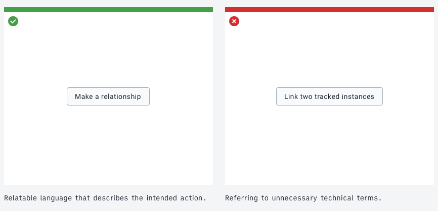
Remember: always communicate to the user.
Error messages
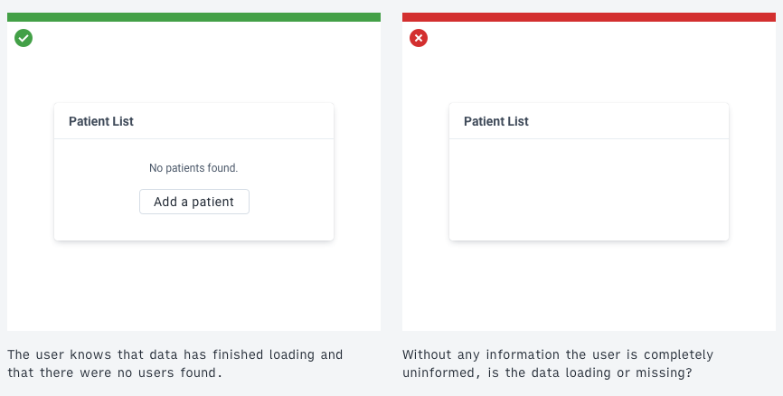
Always inform the user when an error occurs. Do not leave a page or component blank or forever loading. Critical or fatal application errors need to be shown as soon as they occur.
Clear, understandable language is very helpful in error messages. Error messages should be easy to read, concise and, when possible, actionable.
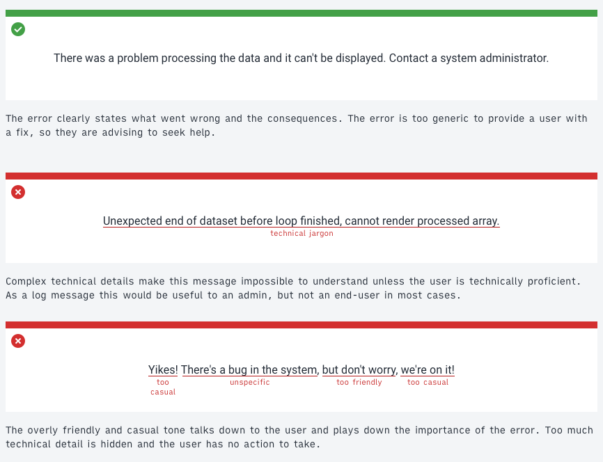
Consider the following error messages, both communicate the same technical error:
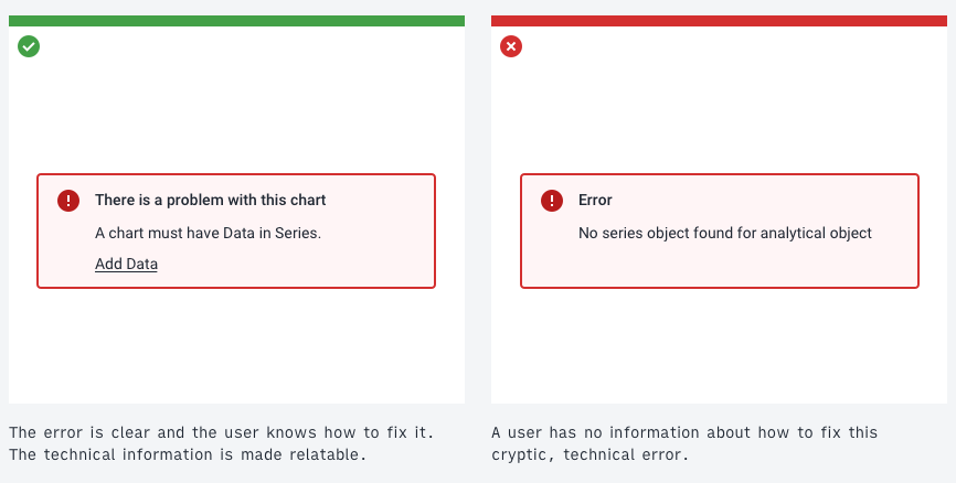
A technical error, like the one in the incorrect example, may make sense to a technical user. For an end-user this information is rarely useful. Provide the information in a way that communicates what went wrong and what can be done to fix it.
Sometimes technical details or logs can be helpful. If so, provide these in an expandable area or as a downloadable file.
Generic errors
It is not always possible to present specific error messages. In those cases, inform the user that something has gone wrong and that they should contact a relevant administrator.
Keeping the user informed
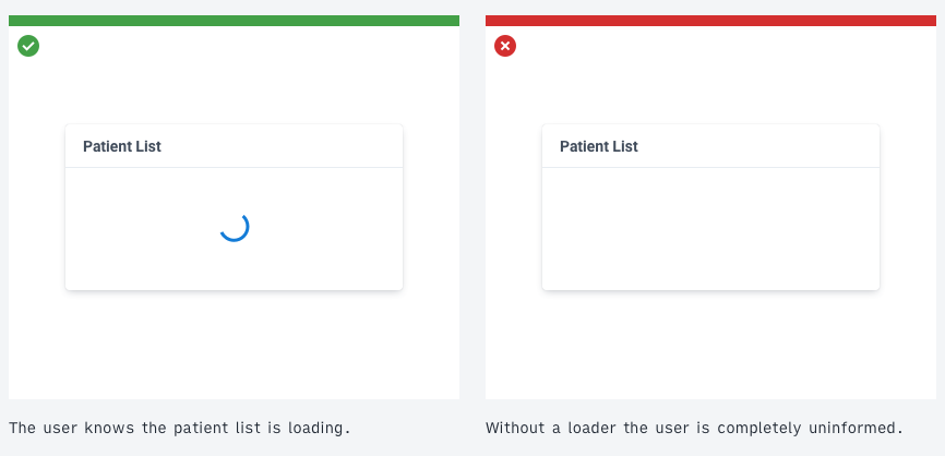
Always keep the user informed. Avoid all situations where a user could be looking at a static or empty screen thinking: "is something happening?".
Practically, this means:
- displaying loading indicators
- communicating 'No data found' instead of blank screens or components
- displaying loading as a progress bar, helping the user understand approximately how long the loading process might take
- informing the user of successes as well as errors, for example when an item has saved successfully
- clearly showing when data or items are being filtered
Examples
Tone of voice
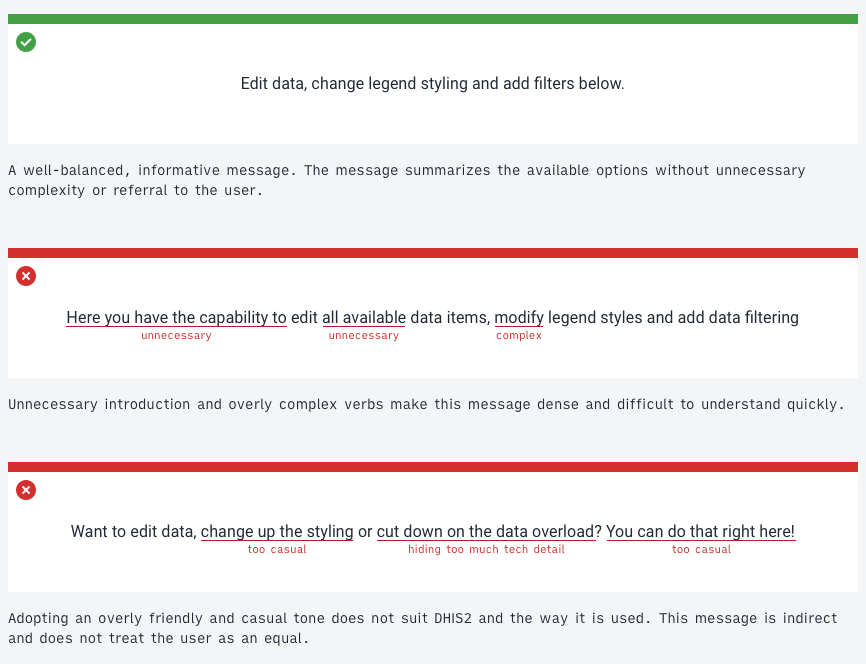
DHIS2 applications should communicate in a clear, honest and friendly tone of voice:
- Clear: Do not overcomplicate sentences or provide more information than needed. Be concise and straight to the point.
- Honest: Be open and upfront about errors and system information.
- Friendly: Be polite while remaining focused. Communication can be casual but do not joke or be overly forward. DHIS2 applications are used in sensitive conditions. Applications should adopt a detached, professional tone.
Examples
Introducing the user to the available features in a modal view
Letting the user know there was an error
Referring to the user
Sometimes it may be useful to refer to the user. When doing so, always use the second-person, referring to the user as you or your. Use these terms sparingly and only where the user must understand that their data is separate from some other type of data. Do not use me or my, which can cause confusion: is the user me, or is DHIS2 me? Using you avoids this problem.
Guidelines for the use of you and your in DHIS2:
- Only use you or your if other, similar items do not belong to the user. For example, when displaying a list of documents, if they all belong to the user simply refer to them as 'Documents'. If some belong documents to the user, and some belong to a wider community then it makes sense to highlight this. 'Your Documents' could refer to the user's documents and 'Community Documents' could refer to all others.
- You or your could be replaced by the currently logged in username. This is useful in situations where a single user login is used in many places. However, be aware that usernames can be very long. Only use username labels where data explicitly belongs to that user and no one else.
- Be aware that you and your may refer to a single user or the DHIS2 instance. In Data Visualizer we refer to 'Your Dimensions'. These dimensions belong to the DHIS2 instance, not personally to the user. In this case, we are using you to distinguish between the custom, user-defined dimensions and system dimensions. Ensure the relationship is clear and the user understands what data belongs to them and what belongs to their shared DHIS2 instance.