Forms
Forms are one of the most common ways an application collects user input. Forms accept various types of user input: text, selection, checkboxes and more. DHIS2 applications should follow some common form guidelines to make sure users are not unnecessarily challenged when working with forms.
Guidelines
There are many different ways forms can be used, so there are no strict rules to follow. These guidelines help to ensure a positive user experience.
Clarity instead of simplicity
Forms are often used to collect complex data. A form cannot always be simple and simplifying complex data can hide important information from a user. Instead of aiming for simplicity, aim for clarity.
Clarity means making the purpose and functionality of the form clear to the user. Do this by providing introductory text, help text where needed and provide feedback at all times. Using the correct input type also helps create a form that a user can naturally interact with.
Predictable and logical
The information collected by a form and the method for input should be predictable and logical. Predictability means that a user can anticipate the information they will need to have ready. Logical means that a form should only require input for the current task. If a form needs to collect information that is not logical or predictable for the user, include help text explaining why that information is required. A user will feel more comfortable inputting data into a form when they understand the process.
Progressive disclosure
Progressive disclosure in forms refers to the method of only displaying inputs when they become necessary. Options that relate to another option can be hidden when the main option is disabled. For example, only display a text input for 'Title' when a user has checked the box labelled "Display a title". Progressive disclosure keeps forms concise and hides unnecessary complexity until it is required.
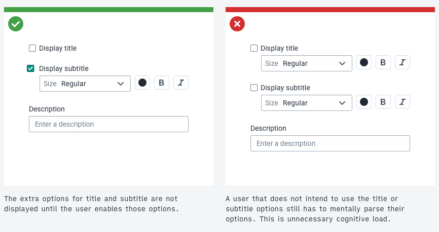
While a useful tool, progressive disclosure should be used with caution. The principles of clarity still apply. Do not hide form inputs or information that are essential to the user's understanding of a form. Where possible, strike a balance between hiding key information and information overload.
Clear purpose
A form should have a purpose that is obvious to the user. A user should not be uncertain about why they are filling in a form or why the information is necessary. Use titles, context and help text to keep the user informed at all times.
In applications that need to collect information for different purposes it is recommended to use separate forms. Each form should have a focused purpose. Attempting to include too much functionality in a single form can be confusing and overwhelming for users and can lead to technical issues.
Feedback at all times
Provide feedback for users where this is needed. Feedback can be in the form of validation and response to user input. There are different types of validation:
-
Type validation: a user has entered an invalid data type into an input. For example, entering "ABC" into a number only input. This input type is wrong and the user should be notified immediately along with guidance about how to fix the problem.
-
Content validation: The data the user has entered is not considered valid based on the context. A user may have entered "2999" for the "Number of pregnancies" field. This is not a soft data type validation because the "2999" is the correct type, but it's content is invalid. Connection with a server is often needed for content validation.
-
Response validation: Informing the user what the status of the form input and response is. "Form successfully submitted" is a type of response validation.
Input types
Forms are made up of different types of inputs. There are various inputs available in the DHIS2 Design System. The documentation for each input covers when it should and should not be used in detail. The table below summarizes the correct usage of each input type.
| Input | Usage | Notes |
|---|---|---|
| Text | Enter free text input | There are multiple types of text input that accept different formats. See the input documentation for details. |
| Single select | Select a single option from a list of many | A select should be used when there are more than 5-7 options instead of radio buttons. |
| Multi select | Select multiple options from a list of many | A select should be used when there are more than 5-7 options instead of checkboxes |
| Checkbox | Single: toggle an option between yes/no, true/false, on/off. Multiple: select multiple options from a list of few. | Single checkboxes must never be a required input as there is no neutral state. Do not use a list of checkboxes for many (7+) options, use a multi select instead. |
| Radio | Select a single option from a list of few | Do not use a list of radio buttons for many (7+) options, use a single select instead. |
| File input | Select a file | Accepted file type and size should be made clear to the user before uploading |
| Transfer | Select and order multiple options from a list of many in different categories. | Use for complex selections that require specific ordering and filtering of categories. |
Form actions
A form should always have a single, clear primary action. Often this action is 'Submit' or 'Save data'. Make sure the user understands what will happen when they submit a form. Additional options, like 'Save and add another', can be offered, but only a single primary action should be included. Make sure the action button label accurately describes the action. See the content and communication section for more information of writing effective button labels.
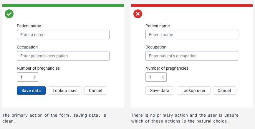
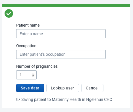
Form actions should always be placed at the end of the form. When a user is working with critical data or a long, complex form it can be helpful to provide help text to remind them of their current context. See the example below.
Discarding data
Always make it clear to users what will happen if they abandon a critical form. Do not alert users when they abandon search or filtering forms, reserve blocking alerts for only when a user will discard data without saving.
Help
Providing contextual help inside a form where a user may need assistance. This is useful for complex forms and forms that a user may not interact with often. Contextual help means that the user does not need to search through documentation or visit another site to get help with their current task.
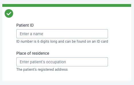
Often a single line of contextual help underneath a form input is enough to guide the user, as in the examples above.
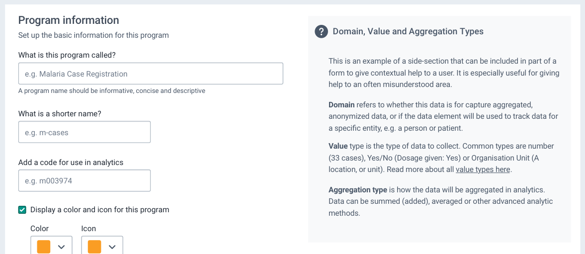
For complex topics or concepts, an information box can help the user understand a section of a form, as in the example above.
Complex forms
Complex forms can be difficult for some users to work with. Some users would prefer a complex form to be broken up into several pages or steps. Other users may prefer a large form to be a single long screen. There is no one-size-fits-all approach to designing forms, understanding the intended user is critical to creating forms that will work for that user. Read more about Designing for the User.